One of the most persistent debates in the investment industry is whether investors are better to use passive or active managed funds. With strong advocates on both sides of this debate, it may seem like an obscure discussion. However, for investors, long term performance data tells a conspicuous story.
Managed funds provide a very efficient investment mechanism. They enable investors to gain exposure to a wide range of underlying companies at a fraction of the cost of buying shares in each of those businesses directly.
What managed funds don’t do is to tell you the best strategy to follow.
At the two ends of the investment spectrum sit alternative philosophical approaches – active and passive. An active fund manager will typically allocate funds into only a handful of companies; these are usually the businesses they believe will perform better than average in the coming period. A passive fund manager does not allocate based on a subjective forecast, instead they usually follow a more systematic process to buy and hold all (or the vast majority of) the businesses in a particular market or segment.
Each year, ratings and index company Standard and Poor’s (S&P) publish a score card to determine if active investing or passive investing performed better, as a whole, over the previous year. The score card, S&P Index verses Active, or SPIVA, answers the question, how many active managers actually did better than a passive benchmark and, conversely, how many did worse.
If you believe that active management is superior to passive management, then you’d probably expect the majority of active managers would be able to beat a simple market index.
If you did believe that, you’d be disappointed to see S&P’s results.
Once again in 2020, the majority of active managers did worse than their respective benchmark index.
We say ‘once again’ because in the US at least, which is the biggest and deepest market for managed funds in the world, it’s the 7th consecutive year this has happened.
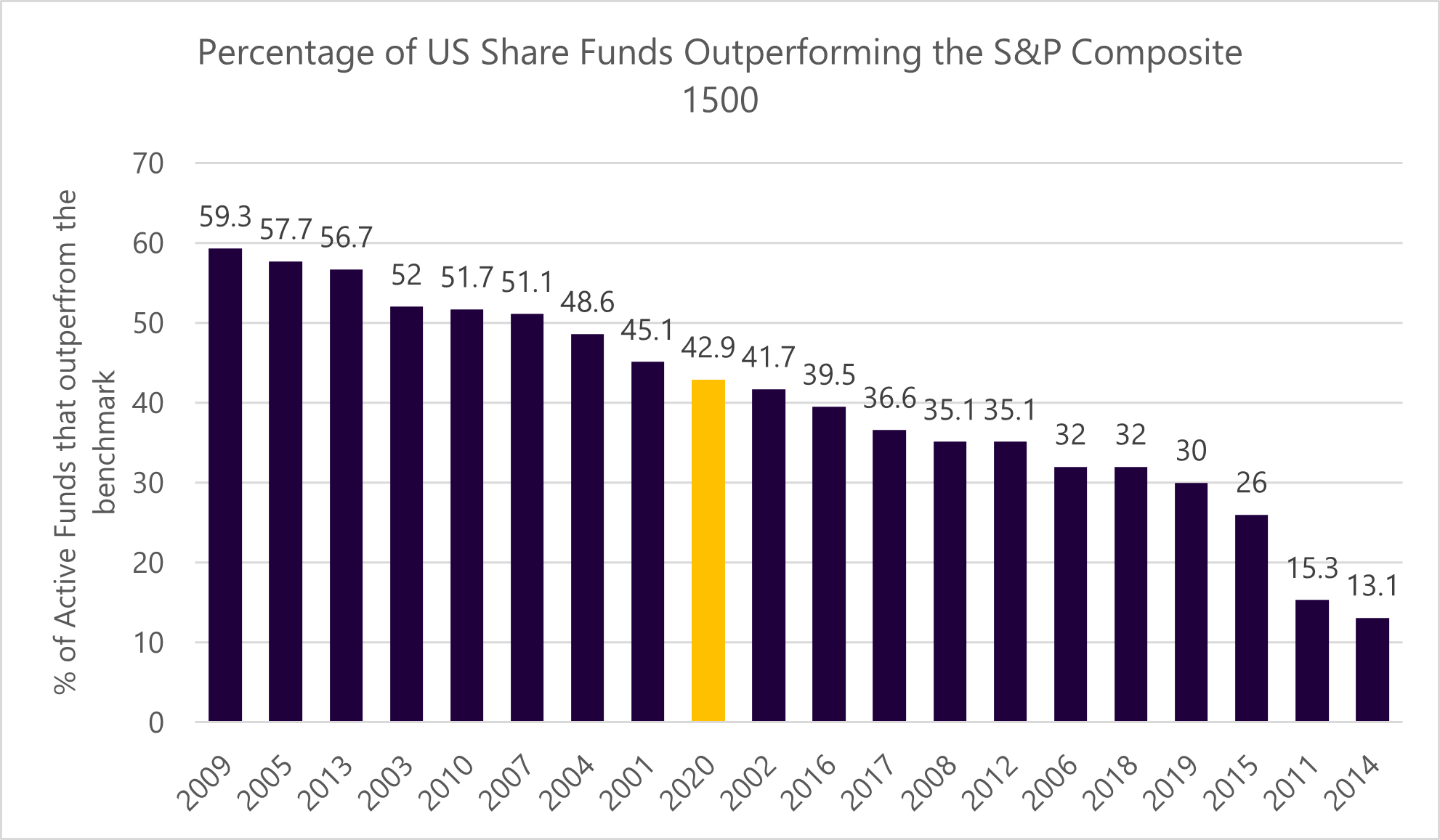
Below is a table with the results for every year since 2001.

Source: S&P Dow Jones Indices LLC. Data as of Dec 31, 2020. Past performance is no guarantee of future results. Chart is provided for illustrative purposes.
As depicted by the yellow column, only 42.9% of active US funds beat their benchmark in 2020. This recent result is especially interesting because if there was a year that active managers had every opportunity to outperform, it would have been in 2020.
With the global pandemic causing significant market upheaval in February and March, a skilled active manager could, for example, have correctly anticipated the turbulence and decided to hold extra cash in their funds. They could have avoided investing in badly affected industries such as airlines and tourism. They could have instead invested into successful digital channels, firms such as Amazon and Google. Even getting just one of these calls right would have had a substantial impact on their relative performance, because 2020 was a year where returns were starkly different between Covid winners and Covid losers.
Yet, despite all of that, the majority of active managers still underperformed.
While 2020 is illustrative, the most important information for long-term investors is how active management compares to a passive alternative in time frames of 10 years or more. Fortunately, S&P collect this data and we are able to look across all global markets to see if active managers, as a group, are adding value in any country, or over any significant period of time.
The answer is a resounding no.
The table below shows the 10 year results for the percentage of active managers that perform better than a passive benchmark index. What’s notable is that none of these numbers are at 50% or higher. In other words, in every country or geographic zone, the majority of active funds have lost to the benchmark index over this longer timeframe.
Fund category |
Comparison Index |
10 Year (%) |
United States General Equity |
S&P 1500 |
17 |
Australian Equity General |
S&P/ASX 200 |
21 |
Europe Equity |
S&P Europe 350 |
14 |
Eurozone Equity |
S&P Eurozone BMI |
8 |
Nordic Equity |
S&P Nordic BMI |
17 |
France Equity |
S&P France BMI |
8 |
Germany Equity |
S&P Germany BMI |
20 |
Italy Equity |
S&P Italy BMI |
20 |
Spain Equity |
S&P Spain BMI |
17 |
Netherlands Equity |
S&P Netherlands BMI |
0 |
UK Equity |
S&P United Kingdom BMI |
35 |
Denmark Equity |
S&P Denmark BMI |
15 |
Poland Equity |
S&P Poland BMI |
37 |
Switzerland Equity |
S&P Switzerland BMI |
16 |
Sweden Equity |
S&P Sweden BMI |
19 |
Indian Equity Large-Cap |
S&P BSE 100 |
32 |
All Japanese Equity |
S&P Japan 500 |
33 |
Brazil Equity Funds |
S&P Brazil BMI |
14 |
Chile Equity Funds |
S&P Chile BMI |
2 |
Mexico Equity Funds |
S&P/BMV IRT |
18 |
Simple Average |
18% |
Source: S&P Dow Jones Indices LLC, Morningstar. Data as of Dec. 31, 2020. Past performance is no guarantee of future results. Table is provided for illustrative purposes.
In fact, the simple average in the table above is only 18%. For the avoidance of any doubt, that means only 18% of active funds beat a passive benchmark over a 10 year period!
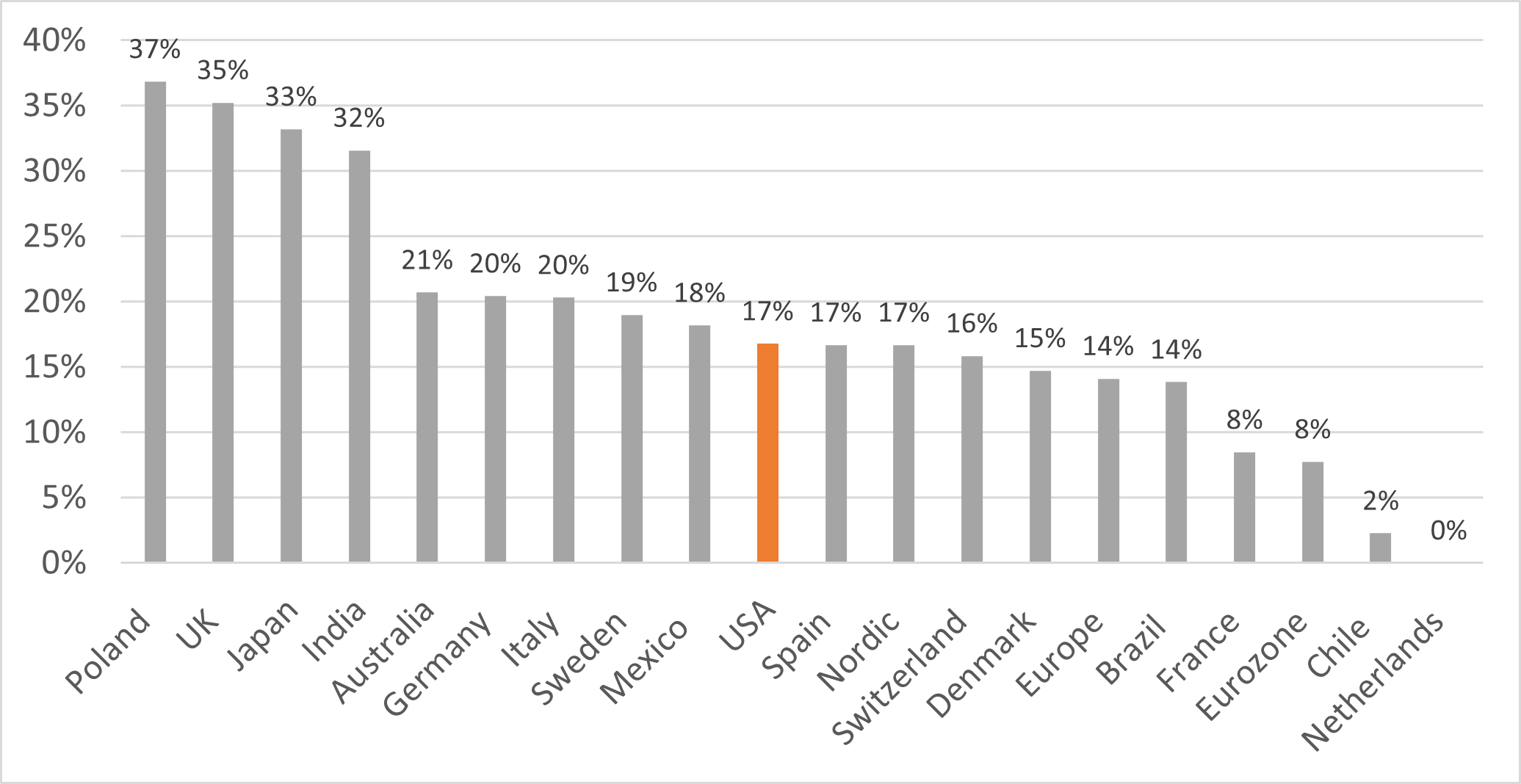
For those who might argue this is just a US phenomenon, and that smaller markets are more fertile markets for active managers to outperform, the graph below (including the same data as the table above) doesn’t back that up. In fact, it shows that the US is right in the middle of this wider distribution of countries. This shows that this active/passive story is not exclusive to the US.

|
Although this may be academic to many investors, this is data and information that we monitor regularly. The implications are clear. If we pay extra to allocate to an active manager, the evidence tells us we should expect to lose. Over a 10 year time horizon, we have, maybe a 20% chance of selecting a fund that beats its benchmark over the decade. We don’t like those odds and we don’t think you should like them either.
But let us make this more interesting and practical. Through our affiliation with Consilium and other likeminded advisers, we have secured access to the lowest cost New Zealand Portfolio Index Fund available to retail investors. We have also secured access to the lowest cost New Zealand SRI fund. The cost to invest in these funds is about 0.10% each. This is a substantial achievement. If we allocate to these funds then, based on the S&P data above, we are fairly certain to beat the majority of more expensive active funds over any considerable time period. Although its true to say that past performance is no guarantee of future results, the data supporting this assertion is compelling.
We’re equally sure that there will be about one out of five actively managed funds that do outperform their benchmark, over a 10 year time frame. Unfortunately, there is no reliable way of knowing who these few outperformers will be ahead of time, especially not the fund managers themselves (although their self-promotion might say otherwise).
So rather than spin the roulette wheel and hope for a lucky pick, we’ll take the known odds that are on offer. By allocating to the lowest cost available NZ managed fund tracking the portfolio index, we give you an excellent opportunity at well above average results.
While this data from S&P may seem academic, it’s incredibly practical. And, over the long term, it helps clarify the strategies that are more likely to help you achieve your long-term investment goals.
Back to Insights